
Almost every WordPress theme these days offers users a responsive web design and obviously a mobile menu.
But if you are a WordPress developer, you should know how to make a mobile menu in the theme you are making or improving for a client.
This is possible with a few lines of CSS and (Vanilla) Javascript code (no Jquery needed).
In the following example, I use ClioWP which is my free WordPress Starter Theme for Developers.
How it works
There can be many approaches to the matter. Here is my preferred solution:
- Create a menu that will be used for the “Mobile menu”, independently of your “Top menu”.
- Hide your “Top menu” on mobile devices and show the “Mobile menu” only on mobile devices (and vice versa). Of course, use media queries in your CSS.
- I use Bootstrap icons for the menu trigger element, but you may use Font Awesome or any similar tool.
Register your menu
In your functions.php:
function set_theme_properties()
{
    register_nav_menu('header_menu_location', __('Header Menu Location', 'cliowp'));
    register_nav_menu('mobile_menu_location', __('Mobile Menu Location', 'cliowp'));
    register_nav_menu('footer_menu_location', __('Footer Menu Location', 'cliowp'));
}

add_action('after_setup_theme', 'set_theme_properties');
Compose Mobile menu from WordPress Dashboard
Dashboard -> Appearance -> Menus
Header.php code
Your header.php will look like this:
<?php
/**
 * The template for displaying the header
 *
 * @link https://developer.wordpress.org/themes/basics/template-files/#template-partials
 */
$menu_params_header = [
    'theme_location' => 'header_menu_location',
    'menu_class'     => 'cliowp-menu-top',
    'container'      => 'nav',
];
$menu_params_mobile = [
    'theme_location' => 'mobile_menu_location',
    'menu_class'     => 'cliowp-menu-mobile',
    'container'      => 'nav',
];
?>
<!DOCTYPE html>
<html <?php language_attributes(); ?>>

<head>
    <meta
        charset="<?php bloginfo('charset'); ?>">
    <meta name="viewport" content="width=device-width, initial-scale=1">
    <?php wp_head(); ?>
</head>

<body <?php body_class(); ?>>

    <?php wp_body_open(); ?>

    <header class="cliowp-header">

        <div class="cliowp-mobile-menu-container">
                <?php wp_nav_menu($menu_params_mobile); ?>
        </div>

        <div class="float-left">
            <p><a href="<?php echo site_url(); ?>"><?php echo get_bloginfo('name'); ?></a>
            </p>
        </div>

        <div class="float-right">
            <?php wp_nav_menu($menu_params_header); ?>

            <i class="cliowp-mobile-menu-trigger bi bi-list" aria-hidden="true"></i>
        </div>

        <div class="clear-both"></div>

        <div class="cliowp-search-container">
            <?php get_search_form(); ?>
        </div>

        <div class="clear-both"></div>

    </header>
CSS code
Example SCSS module:
@mixin cliowp-menu-ul {
    list-style-type: none;
    margin: 0;
    padding: 0;
    overflow: hidden;
}

// top menu --------------------------------------------------------------------
.cliowp-menu-top {
    display: none;
    @include cliowp-menu-ul();
}

@media (min-width: 960px) {
    .cliowp-menu-top {
        display: block;
    }
}

.cliowp-menu-top li {
    float: left;
}

.cliowp-menu-top li a {
    display: block;
    padding: 8px;
}

.cliowp-menu-top li a:hover {
    color: red;
}

// mobile menu -----------------------------------------------------------------
.cliowp-mobile-menu-trigger {
    color: red;
    cursor: pointer;
    font-size: 1.7rem;
    font-weight: bold;
    position: absolute;
    z-index: 10;
    top: 20px;
    right: 20px;
}

@media (min-width: 960px) {
    .cliowp-mobile-menu-trigger {
        display: none;
    }
}

.cliowp-menu-mobile {
    @include cliowp-menu-ul();
}

.cliowp-menu-mobile li {
    padding: 10px;
}

.cliowp-menu-mobile li a {
    color: white;
    display: inline-block;
    width: 100%;
}

.cliowp-mobile-menu-container {
    visibility: hidden;
    position: absolute;
    left: 0;
    right: 0;
    top: -20px;
    font-size: 1.4rem;
    background-color: rgba(49, 87, 55, 0.89);
    padding-top: 38px;
    padding-bottom: 20px;
    opacity: 0;
    transform: translateY(-20%);
    transition: opacity 0.2s ease-out, visibility 0.2s ease-out, transform 0.2s ease-out;
}

.cliowp-mobile-menu-active {
    visibility: visible;
    opacity: 1;
    transform: translateY(0);
}
Javascript code
Example module:
class MobileMenu {
    constructor() {
        this.mobileMenu = document.querySelector(".cliowp-mobile-menu-container");
        this.toggleButton = document.querySelector(".cliowp-mobile-menu-trigger");

        this.toggleButton.addEventListener("click", () => this.toggleMobileMenu());
    }

    toggleMobileMenu() {
        this.toggleButton.classList.toggle("bi-list");
        this.toggleButton.classList.toggle("bi-x-square-fill");
        this.mobileMenu.classList.toggle("cliowp-mobile-menu-active");
    }
}

export default MobileMenu;
See also this topic on how to manage CSS and JS code using @wordpress/scripts.
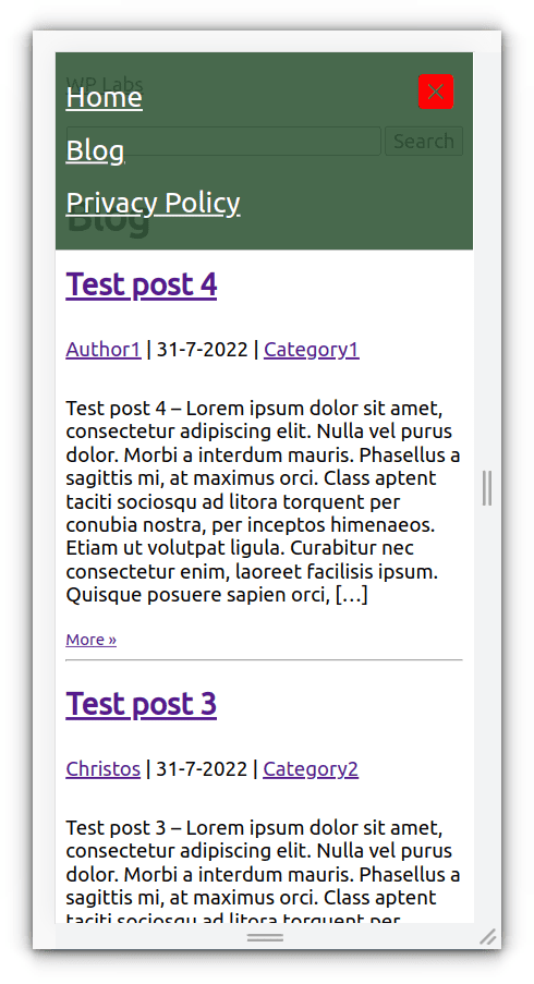
Result


Entrepreneur | Full-stack developer | Founder of MediSign Ltd. I have over 15 years of professional experience designing and developing web applications. I am also very experienced in managing (web) projects.